Monday, February 7, 2022

Renderings (for class projects)

 These are a few renderings I did for projects from both ISU and SDSU. I much prefer building models, I think I'm better and it and models get across my design better. 


Dancing at Lughnasa by Brian Friel

ISU; Class Project; 2002


Buried Child by Sam Sheppard

SDSU; Class Project; Fall 2003
There is a picture of the model for this design as well here (just scroll down).


The Goat, or Who is Sylvia?
by Edward Albee

SDSU; Class Project; October 2004


A Funny Thing Happened on the Way to the Forum 
    music and lyrics by Stephen Sondheim
    book by Burt Shevelove and Larry Gelbard

SDSU; Old Globe Theatres, Lowell Davis Festival State (not realized); Fall 2005


Wednesday, July 14, 2010

American Pioneer (1840ish)

At a church activity I needed to dress like a Mormon Pioneer (Emma Smith to be precise). I did not own a pioneer dress, so I made this one in 2 evenings. There are a couple things I learned in the process, such as I need to move the buttons over so there's no gap in the front. I've learned this before, but I always forget that the hooks cannot go right at the edge. Some day I may remember this before sewing it all and then I won't have to go back and fix it. I'm also toying with the idea of putting some sort of embellishment on the sleeves, so they aren't straight across at the elbow. I think it might make the line more interesting.


Saturday, September 19, 2009

Cakes

I like to make cake. Ok, I like to EAT cake, but decorating them is fun too. These are some of the ones I've made in recent years that I'm particularly proud of.


Spiderman, for my oldest son's 4th birthday:


Train, for my oldest's 3rd birthday:


Just for fun, and to use up some leftover frosting:


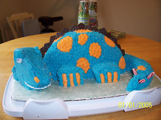
Dinosaur, for my 2nd son's 2nd birthday:


Monday, February 9, 2009

More Models

More examples of models built for various classes.

This castle was built for my model building class. We were learning how to use Photoshop to help us in model making. It's based on a sketch I had used the semester earlier when taking Photoshop.


Private Lives
by Noël Coward.
Act II. I do not have a model of Act I, as we only had to build a model for one of the acts and I wanted to try and build a stained glass window. We were assigned no specific theatre space.

Full set


Detail of window and stage left.


Closeup stage right.


Buried Child
by Sam Shepherd
As difficult as I discovered making a model look old and run down is, I really enjoyed it. One of the earlier models built for Scene Design II at SDSU. We were again assigned no specific theatre, just the generic one for our class.
Full set
Stage left


Stage right


Scissor Sisters Concert

This is a design for a concert tour for the group Scissor Sisters. For Collaborative Studies class, our group consisted of one scenic designer, one lighting designer, one costume designer and one technical director. It was an interesting process, especially as at this point I had never before been to a rock concert in my life. So, unlike my classmates, I had no idea what I was doing! Unfortunately, my technical director couldn't offer any advice as he'd never been to a rock concert either. Our group decided to go in the direction of an old, dilapidated theatre, with a Moulin Rouge type feel. It is a traveling show, it was the technical directors job to make sure the set and lighting could all be broken down to fit into the trucks for transport.
Full set

The 3 platforms in the back (with the lavender curtains beneath them) were audience seating areas--for very high priced tickets! These were to make up for some of the audience space being taken away by our stage jutting out into the audience as it does. The 2 screens on either side are for projections of close ups of the band members.

Floor detail

The platforms which form part of the scissors are for the band. There are footlights along the edge of the stage, as well as rope lighting in the floor which frame out the scissor shape.

The windmill

The windmill does actually spin throughout the concert, there are lights along each of the blades. The colored "shapes" on the proscenium are all painted in glow-in-the-dark paints.

Friday, February 6, 2009

Class Projects

The following are models that I built as class projects. Somewhere I have pictures of older models, eventually I'll get around to putting them up as well. There are several of them, so it'll take a few posts to put them all up.

Unfortunately, I did not take these pictures at the time of building the models, rather I took them much later. Depending on the model it was up to 5 years later. As a result, you can see that the models are looking rather worn from being in storage. In future I will know better and always take pictures upon immediate completion of building anything. They always look the way they are intended to then.

Art by Yasmina Reza

Created for my model building class, I have 3 models of this, as that was the assignment. It had to be all in white, just using different textures. We were not assigned a theatre space.

Art #1


Art #2


Art #3


Othello by William Shakespeare

We were assigned to design for the Globe Theatre in San Diego.
Front view:

Floor detail:
Arch & Rose windows detail:
A scene change:
Detail of gate:


Finding the Sun by Edward Albee

This was for juries at SDSU. I was in one of 3 groups to present for juries that year. I was the only one to keep the show set on a New England beach rather than change it to a West Coast one.


Wednesday, November 5, 2008

The Boy Who Fell into a Book

By Alan Auckbourn for Lamb's Players, The Playhouse on Plaza, National City (San Diego), CA. Designed Fall 2003.

Unfortunately, due to camera malfunctions, I have only the one picture from this show and it doesn't really show the set well. However, it was a fun show to design as it's the only one I've done that was geared for children. It was also very challenging as it was very fast paced and required us to go "through" many different books and their settings.


Twilight of the Golds

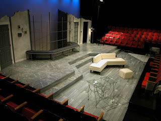
By Jonathan Tolin, for Idaho State University's Powell Little Theatre. Designed Fall 2002. This was my first ever realized set design.

Through design meeting discussions the director and I determined that we would like to have this NYC apartment reflect both the feeling of the play and of the 2 characters that live here, hence the grey set with cold, hard surfaces. It also made it be able to reflect the operatic lighting the script calls for.
As a side note, I also did the majority of the painting on this set, the marbling being a process I developed on my own, based on two other marbling techniques.